

A living room vignette is a deliberate, small grouping of objects arranged to feel purposeful rather than randomly placed. Interior designers use the term “vignette” to describe any curated display that draws the eye, tells a story, and adds personality to a flat surface. When you create an intentional living room vignette, you apply design principles like balance, layering, and breathing room to transform a coffee table, shelf, or console into a focal point. The result is a space that feels considered and calm, not cluttered.
What are the essential components for creating a living room vignette?
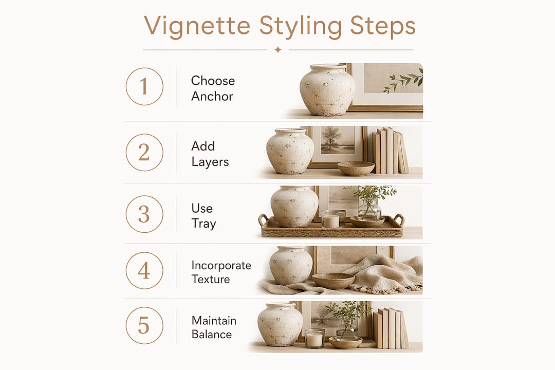
Every well-styled vignette starts with three categories of objects: an anchor, supporting layers, and open space. Interior designers begin with the hero piece to anchor the entire grouping, ensuring supporting items complement without competing. That anchor is typically a tall, visually strong object: a ceramic lamp, a large vase, a framed print leaned against a wall, or a sculptural mirror.
Supporting items fill in around the anchor with varied height, texture, and material. Books stacked horizontally add vertical weight and a readable surface. Candles introduce warmth and organic shape. A small potted plant or a stem of dried pampas grass adds a natural element that softens harder objects. The goal is contrast: smooth next to rough, matte next to reflective, tall next to short.
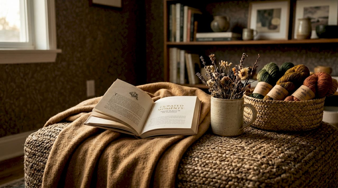
A tray or shallow bowl acts as the foundation that holds smaller pieces together. Trays keep vignettes organized and movable, preserving surface practicality so you can lift the entire arrangement when needed. This is especially useful on coffee tables where function and display share the same space.
Pro Tip: Before buying anything new, audit what you already own. A stack of hardcover books, a candle from your nightstand, and a small plant from another room can form a complete vignette with zero spending.
Here is a quick reference for the core components:
| Component | Role | Examples |
|---|---|---|
| Anchor piece | Visual hero, sets the scale | Lamp, large vase, framed art, mirror |
| Mid-layer objects | Add height variation and texture | Books, candles, small sculptures |
| Natural element | Softens the arrangement | Plant, dried stems, stone, wood |
| Foundation | Groups smaller pieces | Tray, shallow bowl, woven basket |
| Breathing room | Prevents clutter | Empty surface around the grouping |
Color cohesion ties all components together. Repeating colors from the anchor through complementary or analogous hues makes vignette elements feel unified without looking matchy. A navy vase pairs with a cream candle and a book with a blue spine. The palette does not need to match exactly. It needs to relate.
How do you arrange and style a vignette for balance?
Arrangement is where most people get stuck. The process is straightforward when you follow a repeatable sequence. Use the three-part formula of anchor, layer, and breathing room to build a balanced display every time.
- Clear the surface completely. Start from zero. Rebuild from an anchor outward so every item earns its place through height, texture, or story. A blank surface removes the bias of what was already there.
- Place the anchor first. Set your hero piece slightly off-center. Dead center reads as static. Off-center creates movement and draws the eye across the grouping.
- Add height variation. Mix tall, medium, and short pieces to avoid a flat look. A typical combination includes a tall lamp or vase, a mid-height book stack, and a low decorative accent like a small dish or candle.
- Group in odd numbers. Groups of three to five pieces feel natural and dynamic. Even numbers tend to read as formal or rigid. Three objects is the minimum for a vignette to register as a grouping rather than a pair.
- Overlap items slightly. Objects that touch or slightly overlap look intentional. Objects spaced evenly apart look like a lineup. Let a book lean against a vase. Let a small plant sit in front of a taller piece.
- Mix shapes and materials. Pair a round object with a rectangular one. Combine ceramic with wood, or metal with linen. Contrast in material creates the visual tension that makes a grouping interesting.
- Step back and photograph it. A phone camera reveals imbalances the naked eye misses. Small adjustments based on viewing produce a more natural, polished result. If something looks off in the photo, it is off in the room.
Pro Tip: Remove one object from your finished arrangement. If the grouping still reads as complete, that object was filler. Editing down is the single fastest way to make a vignette look more sophisticated.
How to curate a vignette that reflects your personal style
A vignette that looks like a showroom display is not the goal. The best living room display inspiration comes from arrangements that feel collected over time rather than purchased as a set. Using a consistent thread like a shared theme, material, or color direction prevents a vignette from looking random or staged. Mix new pieces with vintage finds deliberately. A modern ceramic next to a worn brass candlestick tells a more interesting story than two objects from the same collection.
Negative space is as important as the objects themselves. Intentional home design reduces visual noise and creates a lighter, more aligned environment. Leaving open surface around your grouping signals confidence. It says the arrangement is complete, not that you ran out of objects.
Functionality shapes personalization too. Define the functional purpose of your room before selecting decor so vignettes reinforce zoning and focal points rather than just filling surfaces. A vignette on a console near the entryway serves a different purpose than one on a living room bookshelf. The entryway grouping might include a small tray for keys, a candle, and a plant. The bookshelf grouping can be purely decorative.
Here are the principles that keep a personal vignette from tipping into clutter:
- Include at least one object with sentimental value: a travel souvenir, an inherited piece, or a handmade item. These objects carry weight that purchased decor cannot replicate.
- Limit your palette to two or three colors within the grouping. More than three colors compete rather than coordinate.
- Use a woven storage basket as both a functional container and a textural anchor. Baskets hold remotes, throw blankets, or small items while contributing warmth and organic shape to the display.
- Reassess the vignette seasonally. Swap one or two objects to reflect the time of year without rebuilding from scratch.
- View the arrangement from multiple angles, including the side. A vignette that reads well from the front but looks flat from the side lacks depth. Viewing from the sofa, the doorway, and the side of the room catches issues that a straight-on perspective misses.
What are common mistakes to avoid when styling a vignette?
Most vignette problems fall into five categories. Recognizing them before you style saves significant rework.
- Overcrowding the surface. More objects do not equal more style. Curated rooms with fewer intentional pieces feel more polished than cluttered ones. If you cannot see the surface beneath your grouping, you have too many objects.
- Relying on perfect symmetry. Symmetry reads as formal and static. Calm visual balance, achieved through contrasts in height, texture, and strategic negative space, is the actual goal. Two identical candlesticks flanking a central object is a mantel formula, not a vignette.
- Matchy-matchy decor. Buying a coordinated set and placing it together produces a display that looks purchased, not curated. Contrast in material, finish, and era creates the friction that makes a grouping feel real.
- Ignoring scale. A small object on a large coffee table disappears. A large object on a narrow shelf overwhelms. Match the scale of your anchor piece to the surface it sits on, then scale supporting items accordingly.
- Filling every flat surface. Not every shelf, table, or ledge needs a vignette. Using fewer, well-chosen items with a repeating pattern prevents overfilling surfaces and gives each display room to breathe.
“The most common mistake is treating a vignette like a collection rather than a composition. A composition has a focal point, a supporting cast, and empty space. A collection just accumulates.”
Editing is not a one-time step. Return to the vignette after a week and remove anything that no longer feels necessary. Fresh eyes catch what familiarity hides.
Key takeaways
A well-executed living room vignette requires an anchor piece, intentional layering with height and texture variation, and disciplined editing to maintain breathing room and visual balance.
| Point | Details |
|---|---|
| Start with an anchor | Place the hero piece off-center first; every other object supports it. |
| Use the three-part formula | Anchor, layer, and breathing room produce a balanced display every time. |
| Group in odd numbers | Three to five objects feel natural; even numbers read as rigid or formal. |
| Edit ruthlessly | Remove one object after finishing; if the grouping holds, the object was filler. |
| View from multiple angles | Check the arrangement from the side and from seating height, not just front-on. |
Why the anchor piece changes everything
The single decision that determines whether a vignette works or fails is the anchor. Every other choice follows from it. When I style a shelf or coffee table, I spend the most time selecting the hero piece and the least time on everything else. Get the anchor right and the rest of the arrangement almost solves itself.
The texture principle is equally underrated. Most people think about color first and texture last. Texture is what makes a grouping feel warm and real rather than flat and staged. A chunky knit throw draped over a basket, a rough ceramic next to a smooth glass object, a linen-covered book beside a polished wood tray. These contrasts register in the room even when you cannot name them.
Breathing room is the hardest discipline to maintain. The instinct is to fill space. Resist it. A surface with 40% open space looks more intentional than one that is 80% covered. The empty area is not wasted. It is what makes the objects visible.
One practical habit that holds up over time: treat your vignette as a living arrangement, not a finished project. Swap one object per season. Rotate pieces from other rooms. The vignette that evolves stays interesting. The one that never changes becomes invisible.
— Stitched
Build your vignette with pieces that last
Elarahandmadeboutique carries handcrafted baskets and cozy textiles designed specifically for the kind of intentional, layered styling described in this article. The handmade organization baskets work as both functional storage and textural anchors in any vignette grouping. Pair one with a soft sage throw blanket or a textured pillow cover to add warmth and contrast without buying mass-produced decor. Every piece from Elarahandmadeboutique is small-batch and artisan-made, which means each one carries the kind of character that makes a vignette feel collected rather than assembled.
FAQ
What is a living room vignette?
A living room vignette is a small, curated grouping of objects arranged on a flat surface to create a balanced, intentional display. It typically includes an anchor piece, layered supporting objects with varied heights and textures, and open space around the grouping.
How many objects should a vignette have?
Groups of three to five objects produce the most visually natural results. Fewer than three reads as a pair rather than a composition. More than five risks crowding the surface and losing the focal point.
What surfaces work best for a vignette?
Coffee tables, console tables, bookshelves, mantels, and side tables all work well. The surface size determines the scale of the anchor piece. Larger surfaces need a taller or broader hero object to avoid the grouping looking lost.
How do I keep a vignette from looking cluttered?
Place all objects on a tray to define the grouping boundary, limit your color palette to two or three hues, and leave at least 30 to 40 percent of the surface empty. Editing down to fewer, stronger objects consistently produces a cleaner result than adding more pieces.
How often should I update my vignette?
Reassess the arrangement every season and swap one or two objects to keep it current. Rotating pieces from other rooms, adding a seasonal natural element like dried stems or a small pumpkin, or changing a candle color is enough to refresh the display without rebuilding it entirely.